
How to combine natural wood and wall colors

Introduction
Integrating natural wood elements with wall colors is a fundamental design technique used to create balance, warmth, and character in a home. Wood brings organic texture and a sense of nature indoors, while wall colors set the mood and define the spatial perception of a room. Understanding how to pair these two elements allows you to transform a sterile space into a cohesive environment that feels both intentional and inviting.
Applying the right color theory to your woodwork is essential when renovating or redecorating. Whether you are working with dark mahogany, light oak, or reclaimed timber, the choice of wall paint will either highlight the grain of the wood or compete with it. Mastering this combination is particularly useful when trying to manage light levels, adjust the perceived size of a room, or establish a specific aesthetic, such as tropical, minimalist, or rustic.
Understanding wood undertones and color temperature

Before selecting a paint swatch, you must identify the undertones within your natural wood. Wood is rarely a single, flat color; it contains subtle hints of red, yellow, orange, or even gray. For instance, tropical woods common in the Caribbean often feature deep reddish or golden undertones. If you ignore these undertones, the wall color may clash, making the wood appear muddy or overly aggressive.
To achieve harmony, you can either lean into the existing temperature or create a deliberate contrast. Warm woods, such as cherry or cedar, pair beautifully with warm neutrals like cream, beige, or terracotta. If you want a modern, sophisticated look, you can use cool-toned walls—such as light blues or soft grays—to provide a crisp backdrop that makes the warmth of the wood pop. Always test paint samples in the same light as your wood furniture to see how the hues interact throughout the day.
Balancing light and dark tones
The relationship between the darkness of the wood and the lightness of the walls dictates the "weight" of a room. This balance is crucial for maintaining a sense of openness and preventing a space from feeling cramped.
| Wood Tone | Recommended Wall Strategy | Resulting Atmosphere |
|---|---|---|
| Light Wood (Oak, Pine, Maple) | Darker or saturated colors | Creates depth and a focal point |
| Medium Wood (Teak, Walnut) | Neutral or pastel tones | Maintains a balanced, airy feel |
| Dark Wood (Mahogany, Ebony) | Light, bright, or off-white tones | Prevents the room from feeling heavy |
Using light-colored walls with dark wood is a classic way to ensure a room feels bright and spacious. Conversely, if you have light wood floors or furniture, using a slightly darker or more saturated wall color can prevent the room from looking washed out.
Creating monochromatic and contrasting schemes
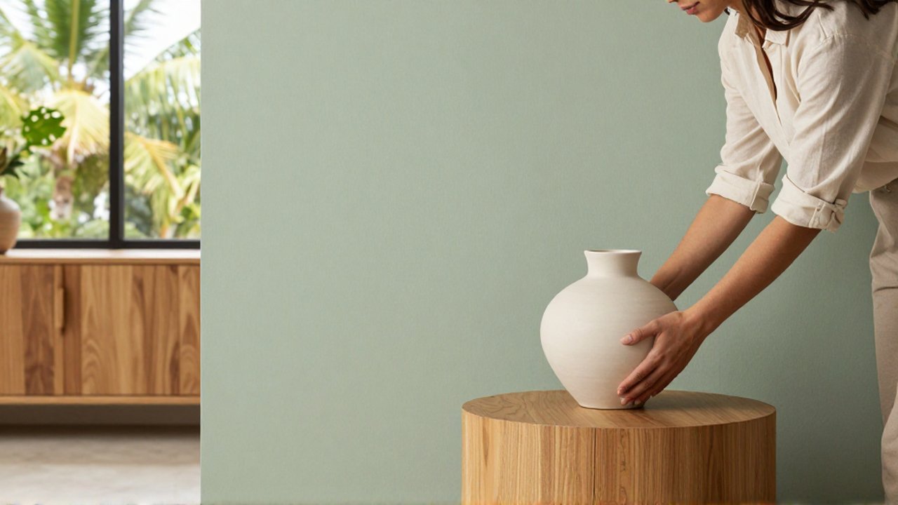
There are two primary ways to approach the combination: the monochromatic approach and the high-contrast approach. The monochromatic method involves using colors that belong to the same family as the wood. For example, pairing light honey-colored wood with tan or sand-colored walls creates a seamless, calming, and expansive environment. This is highly effective in smaller living areas where you want to minimize visual "noise."
The high-contrast approach is for those who want the wood to act as a statement piece. Using a deep navy blue or a forest green against light wood highlights the natural patterns of the grain. Similarly, placing dark wood against a crisp white or soft pearl wall makes the furniture or architectural woodwork the undisputed star of the room. The risk with high contrast is that it can feel "busy" if too many different colors are introduced at once, so it is often best to limit the palette to three main colors.
Common mistakes to avoid in wood and color pairing
One of the most frequent errors is selecting a wall color that has the same intensity as the wood grain. When the saturation of the paint matches the saturation of the wood, they compete for attention, leaving the eye unsure of where to rest. This often results in a room that feels visually cluttered or "flat."
Another mistake is ignoring the impact of natural light. A wall color that looks perfect in a showroom may appear completely different next to a large piece of dark wood in a room with varying sunlight. In tropical climates, where sunlight can be intense, colors may appear more washed out, so choosing a slightly more pigmented paint can help maintain the desired effect. Finally, avoid using overly busy patterns on walls when you already have heavy wood textures; the combination of complex grain and complex patterns can be overwhelming.
Frequently asked questions
Can I use cool gray walls with warm wood? Yes, this is a popular modern technique. The coolness of the gray provides a neutral backdrop that allows the warmth of the wood to stand out, creating a sophisticated contrast.
What color goes best with reddish wood? Colors that neutralize the red, such as soft greens or blues, work well. Alternatively, warm neutrals like cream or beige can enhance the cozy, traditional feel of reddish tones.
How do I make a room with dark wood look larger? The most effective way is to use light, reflective wall colors. White, light gray, or very pale pastels will bounce light around the room, offsetting the "weighted" feeling that dark wood can sometimes create.
Does the floor color affect the wall color choice? Absolutely. The floor is your largest plane of wood. Your wall color should complement the floor's tone to ensure the room feels cohesive from the ground up.
Leave a Reply